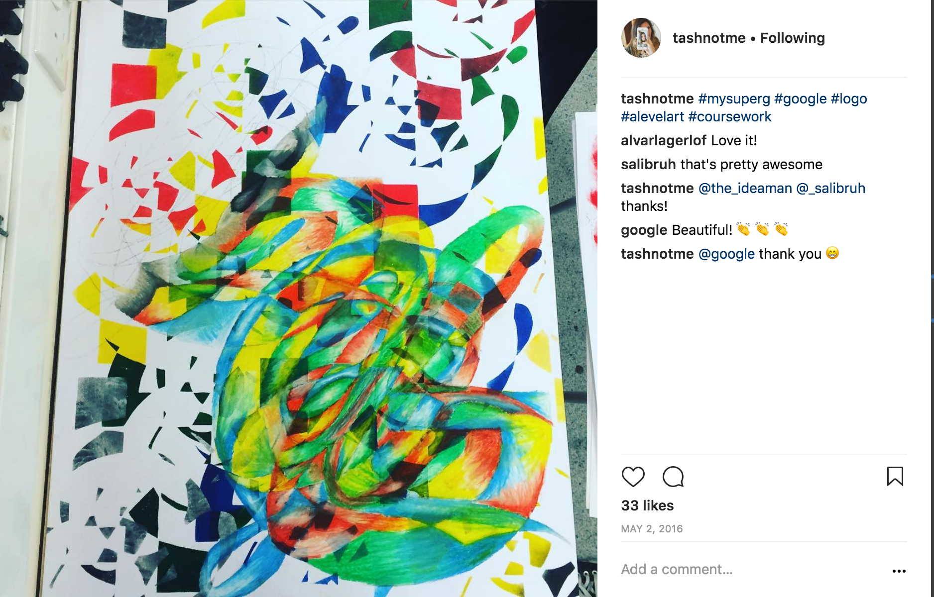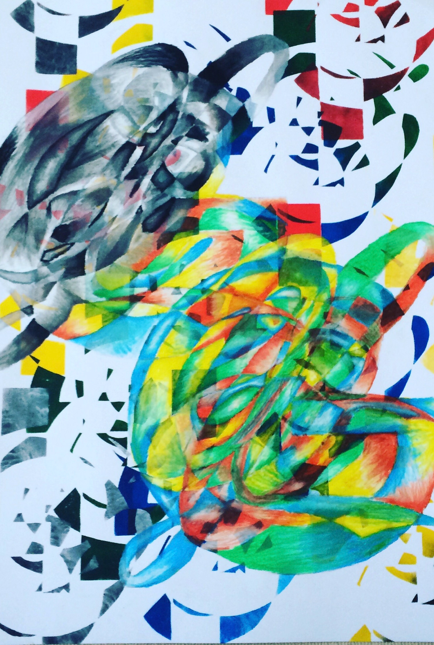
Using the influence of both Jasper Johns and Alan Kitching I have produced my own busy version of a Google Super G. This A1 mixed media work consists of two main layers. The first being a cut out stencil of the Goggle logo on a separate piece of acetate where I have layered the letters of the Google logo much like Jasper Johns in his number series and selected a few of the overlapping cross-sections to cut out and stencil along the background of the A1 sheet. I have stencilled these using acrylic paint in the main colours of Googles logo. Above this layer I have combined the classic Google Super G layering this with the remaining layers in the Google logo to be in the classic Coca Cola font. This upper layer was first drawn in pencil and then oil pastels to create a greater texture of blend. The oil pastel clings to the roughly applied acrylic paint below giving a bolder stronger and perhaps ‘punchier’ effect. This higher layer is repeated twice once in a coloured version on the bottom right hand side of the page and then repeated as it fades to a grey scale version in the upper left-hand part of the page.
The main aim of this piece was to challenge myself to see whether specific examples of recognisable fonts and logos can be recognised and identified when out of context. I realised some elements can be seen clearly such as the Google Super G in the bottom right of the artwork, but other elements do get lost and can only be seen on close inspection. I posted a picture of my unfinished and then completed work to Instagram in 2016 and received replies from Google commenting favourably on my work.