Thalia Pellegrini is a registered nutritional therapist who graduated as such in 2009 from the institute of Nutrition (ION) in London. During an internship at Proximity London I was offered the opportunity to work with Thalia to brand her new company Thalia Pellegrini Nutrition that strives to provide evidence-based, bespoke nutrition and lifestyle guidance.
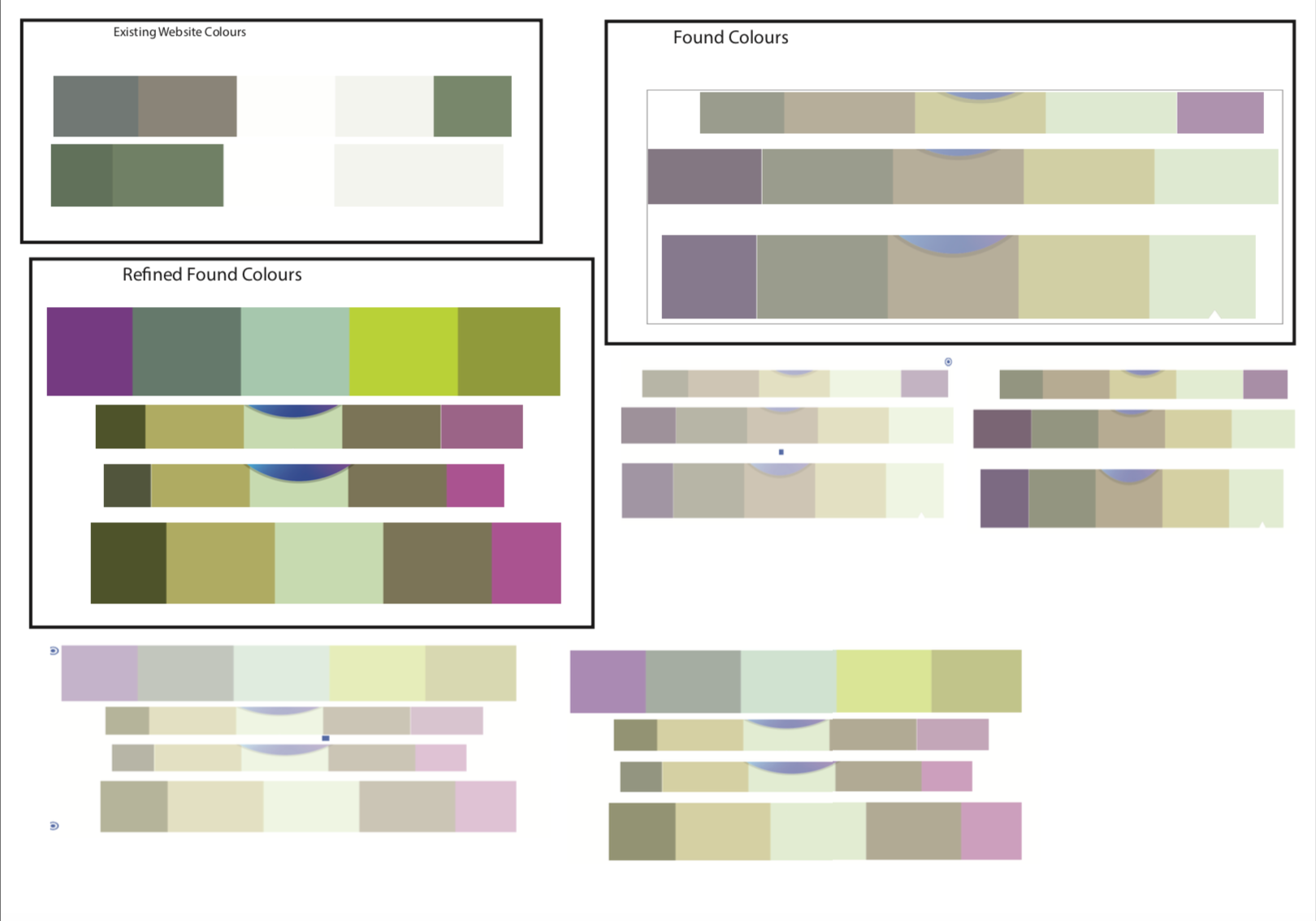
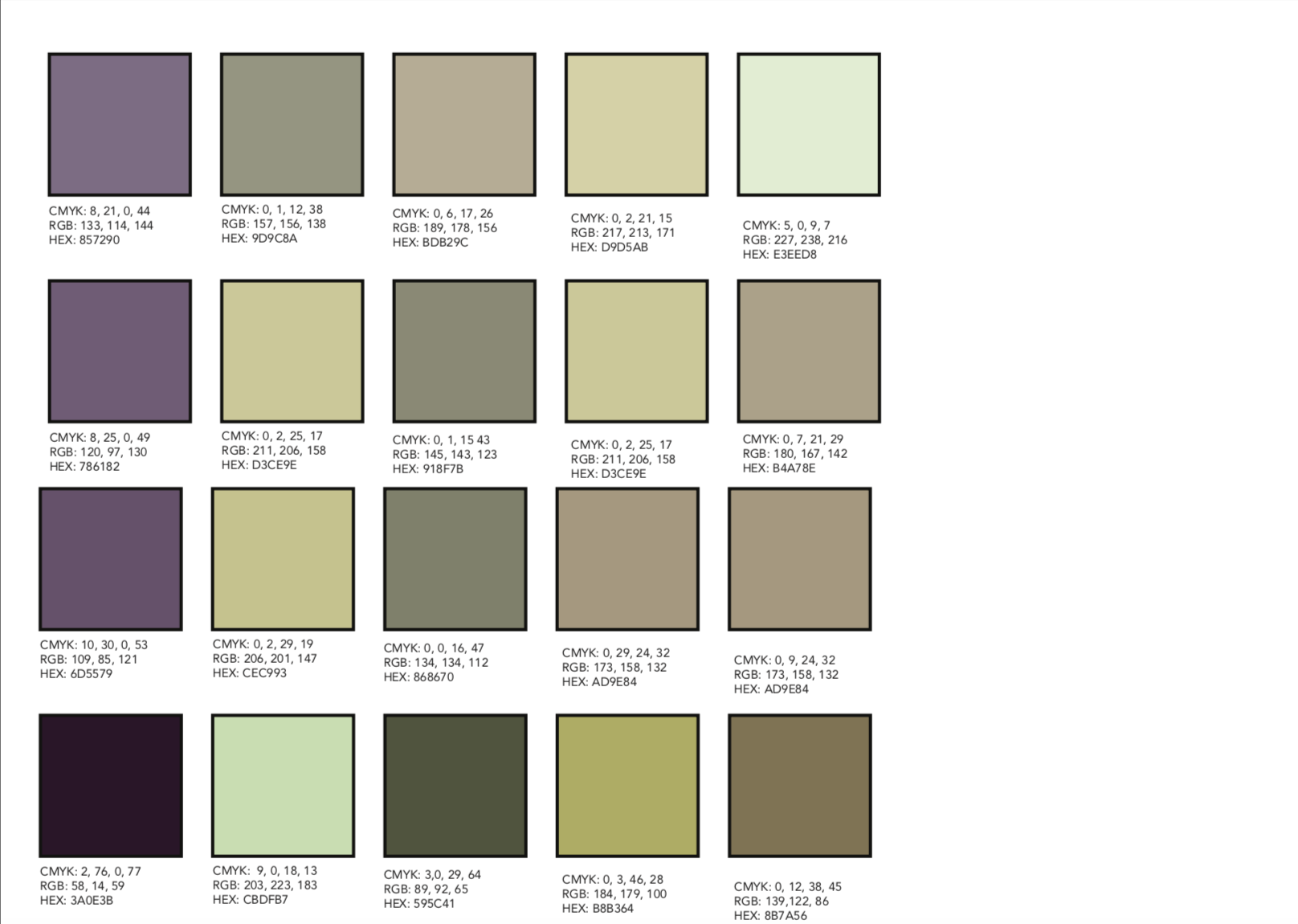
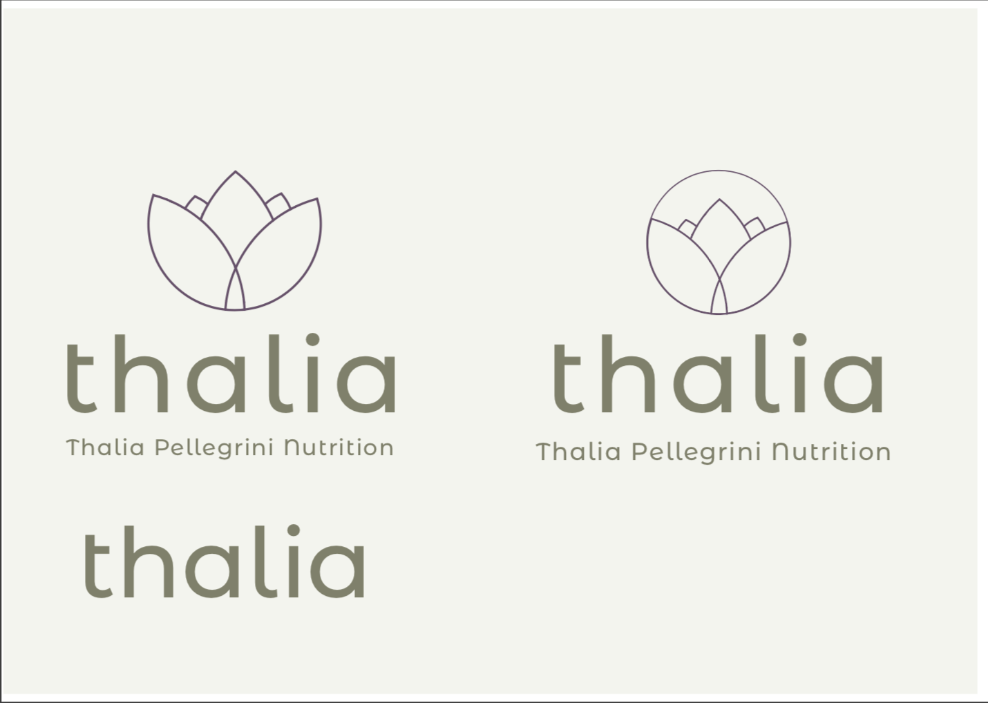
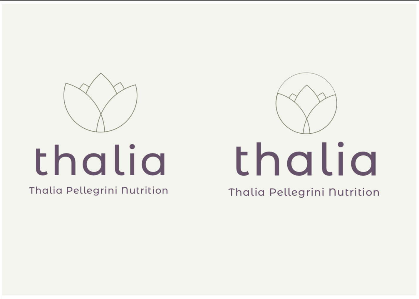
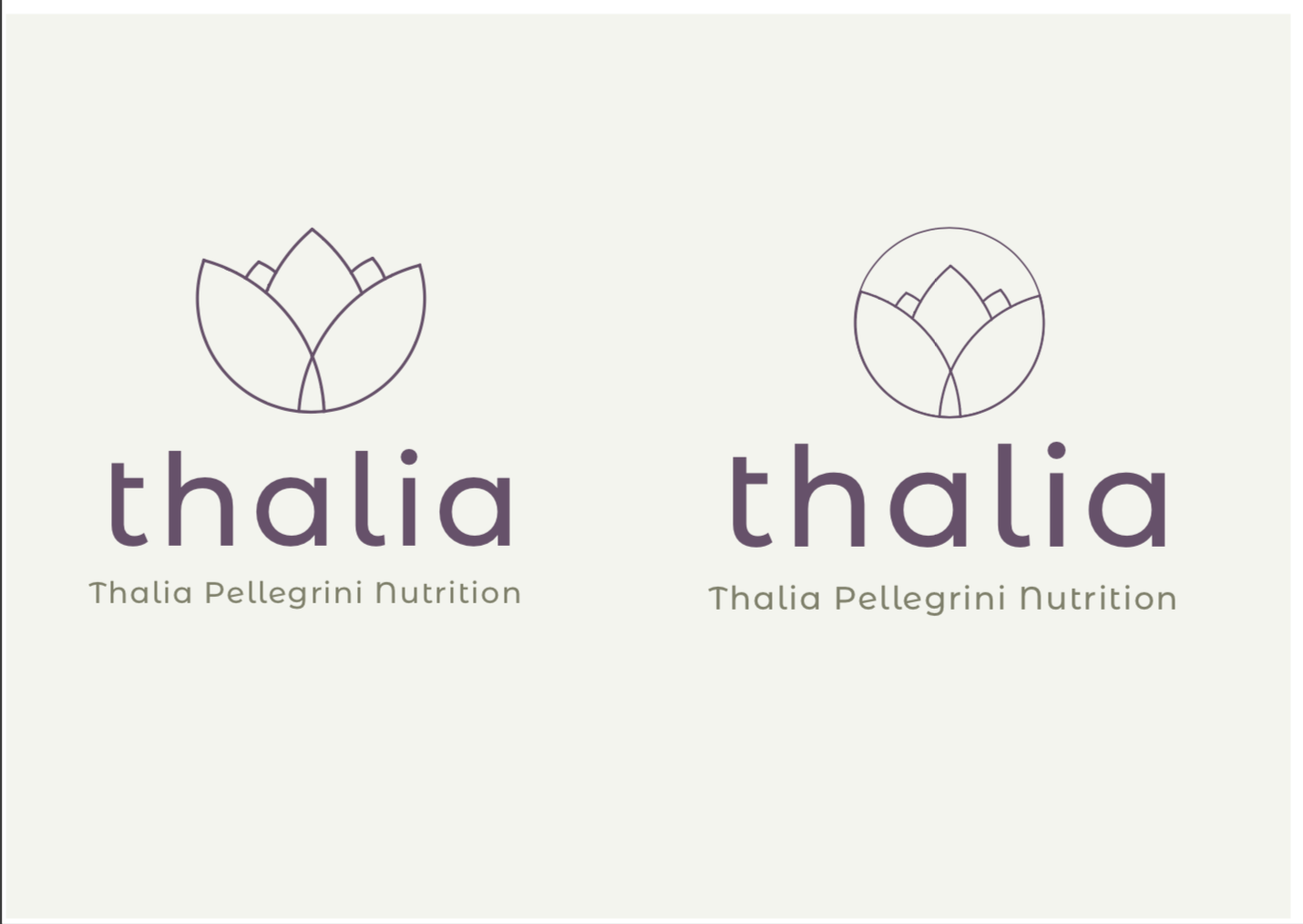
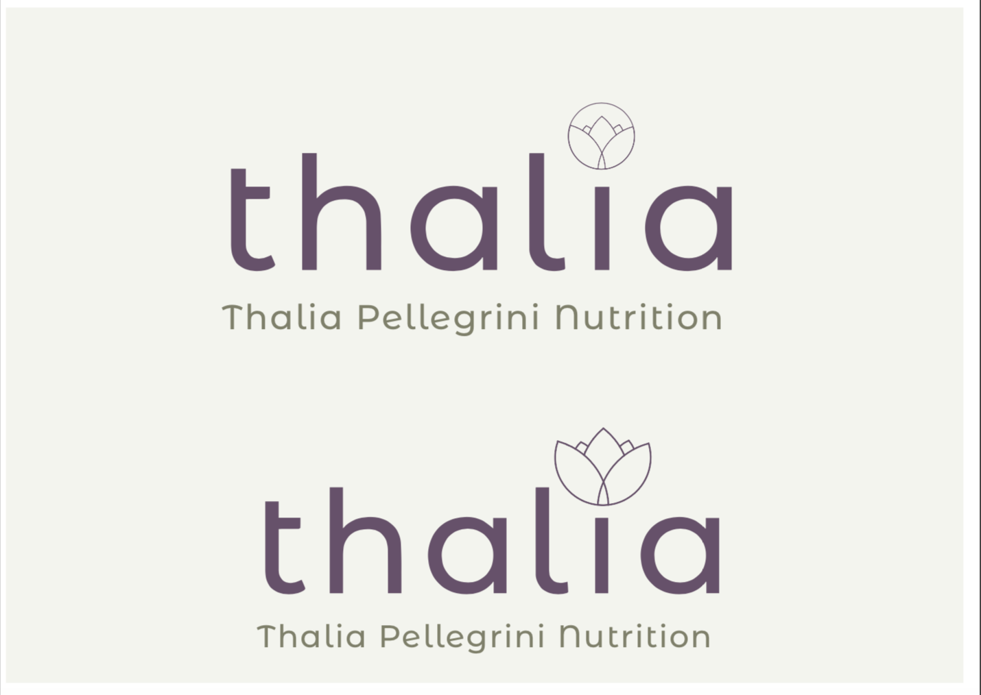
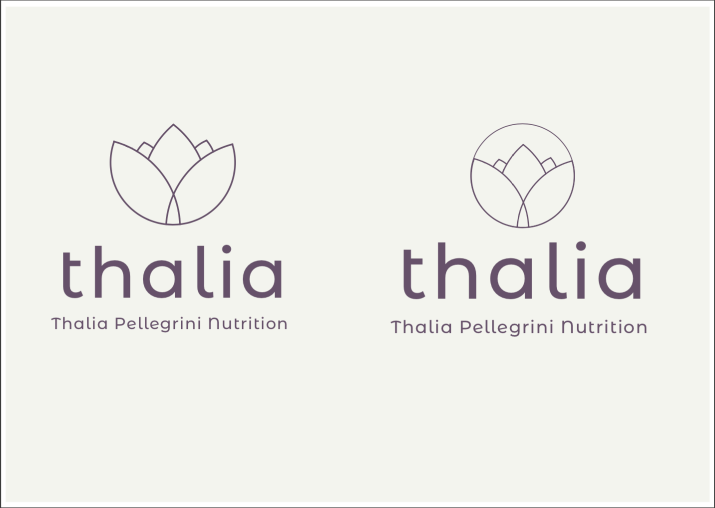
My initial thoughts when receiving the brief were to look at her existing material such as a developing website and identify a clear colour pallet. In the brief Thalia specified she wished to use the colour Khaki and I agreed that it was an interesting choice, trying to pair the earthy tone with a slightly more accenting colour I also believed was necessary to enhance the brand. The new colour pallet consists of some muted khaki colours alongside an accenting aubergine tone which Thalia named as such.
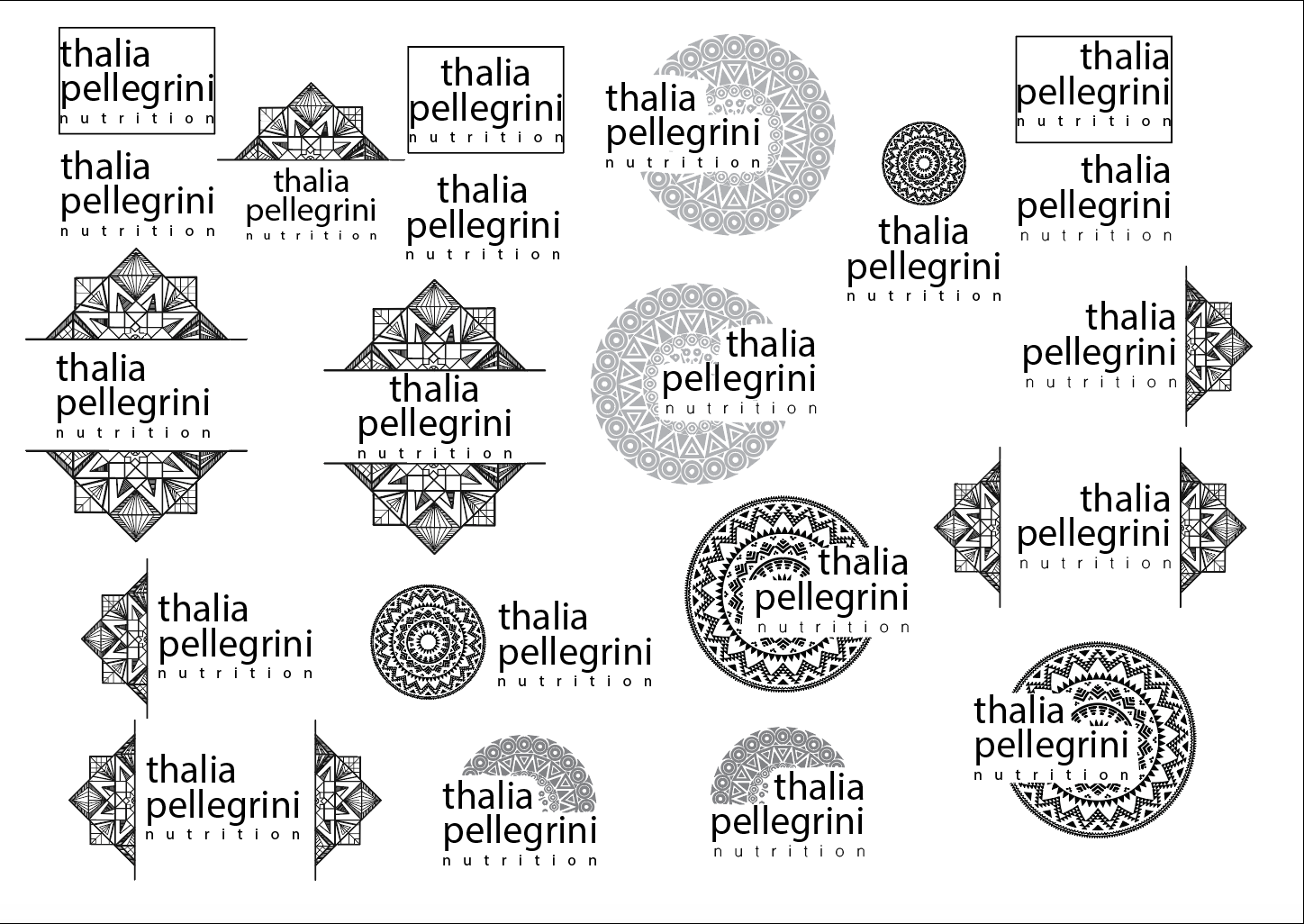
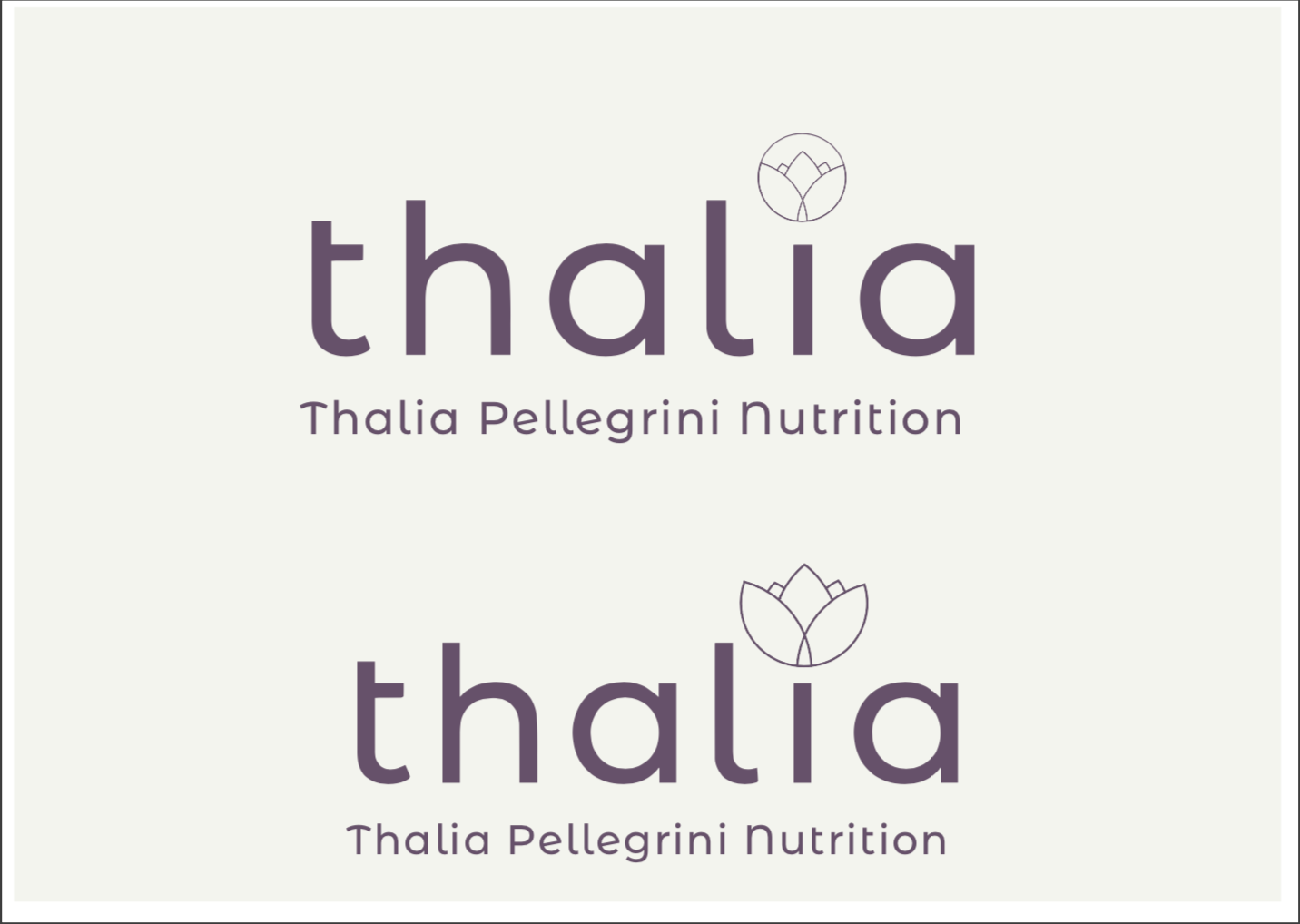
Within the brief Thalia specified that she mainly appeals to women who she likes to think of as a tribe who can support and energise themselves. Therefore my initial concepts included some modern tribal design which later turned into much more simplistic design. In my eye the flower icon was a modern version resembling a form of vegetable flower, but other opinions have said that it seems to represent female fertility something that Thalia tailors diets towards. The typeface used is Montserrat a delicate modern sans serif that appeals to the delicate nature of Thalia’s work.